

The decision: how much a customer is worth paying for, and how fast you get it back.
Cost per acquisition is easy to report and easy to hit. Cost per profitable acquisition is the number that should be setting the media plan, and it is almost never on the dashboard, because it needs acquisition spend and billing to be on one definition of a customer.
Questions It Answers
- Which channels and campaigns produce profitable customers, not just cheap ones?
- Which sources look good on cost per acquisition and bad on payback?
- When does a customer from each channel reach break-even?
- What are the customers acquired this month likely to be worth?
- How should next quarter's acquisition budget be split?
Breakeven, Before You Get There
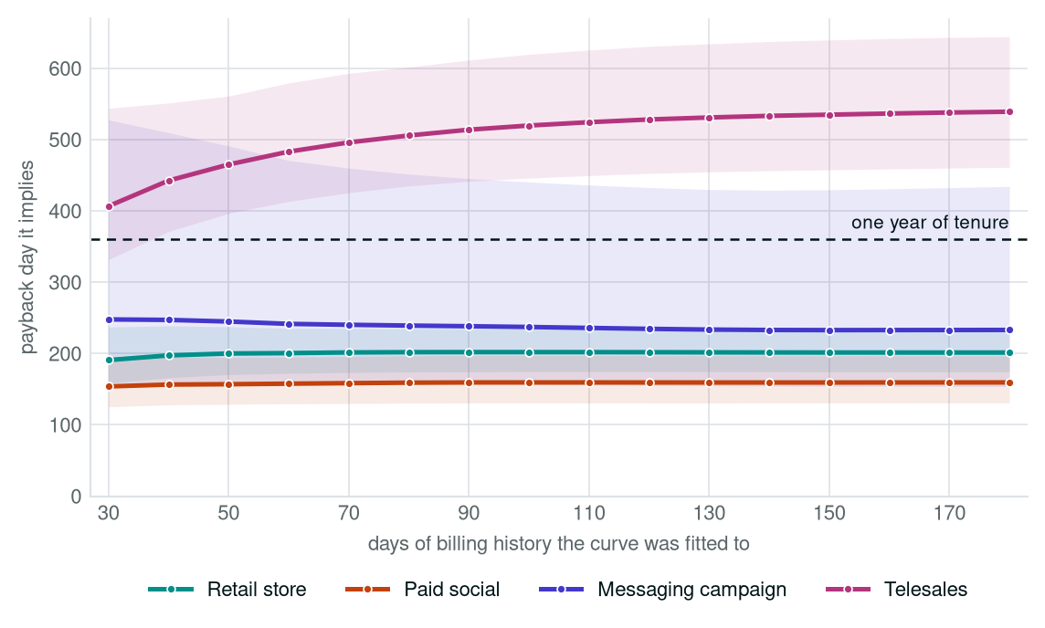
For most of a customer’s first year the billing data says only one thing: nothing has paid back yet. Worse, the channel that is ahead while you wait is not the one that is ahead at a year. A curve fitted to the billing you do have says when each one crosses, when they overtake each other, and how much room the evidence still leaves for it to be wrong.
Drag the slider. It changes how much billing history the curve is allowed to see, and the axis stays fixed at a year, so what you are watching is how quickly the answer stops moving. Where two curves cross, the ranking changes.
- Solid band, its width: subscribers still active at that day of tenure. Wider means more people behind the number, not a wider margin of error.
- Pale band: a 95% interval on the fitted curve, widest where the evidence is thinnest. It is how far the curve would move on a different year of customers. It cannot cover what never reached the extract.
- Dot on the breakeven line: the day that channel covers its acquisition cost. The whisker through it is how far that date is still open to argument; one that runs off the edge is not settled by a year of tenure.
| Channel | Acquisition cost | Value at 1 year | Multiple | Breakeven day |
|---|
What We Analyse
Cost against return
What each channel costs per acquired customer, set against what those customers return across their life, cohort by cohort.
The payback day
When each cohort crosses into profit, by channel and campaign, including the ones that have not got there yet.
Where the ranking changes
Which channels overtake which, and when, so budget does not follow a ranking that is about to reverse.
What is actually settled
How much billing history it takes before those dates stop moving, and how wide the range around them still is.
The work behind those four figures is three steps, and the third is the one most reporting skips.
-
Acquisition spend, joined to billing What each channel and campaign cost per customer acquired, set against what those same customers have billed since, cohort by cohort. It runs on records you already keep for finance and for reporting.
-
A curve fitted to each channel’s own history Value per customer climbs quickly at first and then flattens as subscribers lapse. That shape is fitted to each channel separately, carried past the end of the billing that exists, and carried with a range: how far the same evidence would let the line move on a different year of customers.
-
An honest account of what is settled Some of these figures stop moving after a month of billing. Others are still moving after six, and one kind of date will not settle inside a year no matter how long you wait. The analysis says which is which instead of reporting all of them to the same confidence.
What Your Data Has To Carry
Acquisition cost by source
What each channel and campaign cost, at whatever granularity you hold it. Monthly spend by channel is enough to start; campaign-level is better.
Billing history per customer
What each customer has been charged and what settled, with dates. Daily granularity if you have it: a monthly roll-up throws away 29 points in 30 exactly where the curve is steepest.
The join between them
Whatever links an acquired customer back to the campaign that acquired them. Where that link is broken or missing, we report the size of the gap rather than assuming through it.
What Is Inside The Analysis
Not a second copy of the chart above. The one thing the slider cannot do: hold every view of the year in the same glance.
- Executive summary of which channels have paid back, which have not, and what the gap is worth
- What the billing shows placed beside what the curve projects, per channel, and why those two rankings disagree
- Six views of the same year, fitted to one month of billing through to six, laid out side by side
- The payback date each of those views implies, and how far it is still open to argument
- Where the ranking changes during the year, and on which day it changes
- Prioritised recommendations, what the analysis cannot tell you, and the full method
The argument is how little it moves. In both sample industries the projected ranking is decided by the first month of billing and never changes after it. A payback date for a channel with room to spare is decided almost as early. The date for a channel that only just clears its acquisition cost is not decided by a year of billing and never will be. Knowing which of those three you are looking at is the difference between a budget decision you can make this quarter and one you cannot.
Before You Enter Your Email
The data is synthetic, on purpose
No customer of ours appears in this analysis. The billing behind the curve is simulated subscriber by subscriber: they arrive on their own days, lapse on their own schedules, and records are periodically purged the way a real database purges them. It is not toy data tuned to make a curve fit.
A range, on purpose, not a date
Every projected figure carries the range the same evidence allows, and some of those ranges are wide. Where a payback date is not settled by the billing that exists, the analysis says so rather than reporting a single day to a confidence it has not earned.
Your email is not a mailing list
We send the analysis, and one follow-up asking whether you want this run on your own data. That is it. No newsletter, no sharing with anyone, and replying "no thanks" ends it.
Get the sample value analysis
The chart above is one view of the year. The analysis holds six of them in the same glance, fitted to one month of billing through to six, so you can see how little the answer moves between them. Pick an industry and we send that one as a PDF.
On Your Own Numbers
The Revenue Diagnostic runs this work on your own acquisition, billing and behavioural data, alongside the churn and cross-sell picture, on one set of numbers. On your own data the chart above becomes your channels, your acquisition costs, and the day each one crosses into profit.
