

The decision: which customers are worth spending money to keep.
Not every cancellation deserves a save offer. A single churn rate averages the causes you can fix together with the ones you were never going to move, which is how a retention budget ends up spread evenly across customers worth very different amounts.
Questions It Answers
- Why are customers leaving, and which of those causes can you actually move?
- Where is recurring revenue leaking out of the base, and how fast?
- Which cohorts justify an intervention, and which are better let go?
- How much is each cause worth fixing, in euros rather than in percentage points?
- Which customers are most likely to lapse in the next 30 days?
What We Analyse
Churn in a carrier-billed business is rarely one thing, and it is often not churn at all.
-
Lapse, not cancellation Establish what actually ended the relationship. A failed charge, an expired card and a deliberate cancellation look identical in most extracts and mean entirely different things commercially.
-
The behaviour that came first Find what changed before the ending, in the weeks that preceded it: engagement decaying, topups thinning, usage flattening, a service interaction that went badly.
-
Attribution to a cause Rank those signals by how much they actually move churn risk, individually, and attribute each one back to the customers it applies to.
-
A price on each cause Convert the ranking into money by putting the revenue of the affected cohorts against it. That is what turns a list of drivers into a decision about where retention budget goes.
-
Testing it holds Check the result against customers and periods deliberately kept out of the work, so a finding that only holds where it was built never reaches you.
What Your Data Has To Carry
Customer and subscription records
Who is on the base, when they joined, what they are subscribed to, and when they stopped. Anonymised identifiers are fine.
Billing and payment history
Charges attempted and charges settled. The distinction matters: a failed charge is not a cancellation, and treating them alike corrupts every churn figure downstream.
Behavioural events
Whatever engagement you already log. Sessions, usage, topups, service interactions. It does not need to be complete, and gaps get reported rather than filled in.
None of this requires new data collection or access to production systems. One extract is enough.
What You Get
Ranked causes, not a score
The behaviours actually driving churn, ordered, each one attributed back to the evidence behind it so your team can argue with it.
A euro against each cause
What each driver is costing, so the first thing you fix is the one worth fixing first rather than the one easiest to describe.
Risk cohorts by value
Which segment lapses next, ordered by the revenue at stake rather than by headcount.
Prioritised recommendations
What to do, in what order, with an explicit note on which causes the data says you cannot move.
What Is Inside The Report
- Executive summary of who is churning and what it is costing
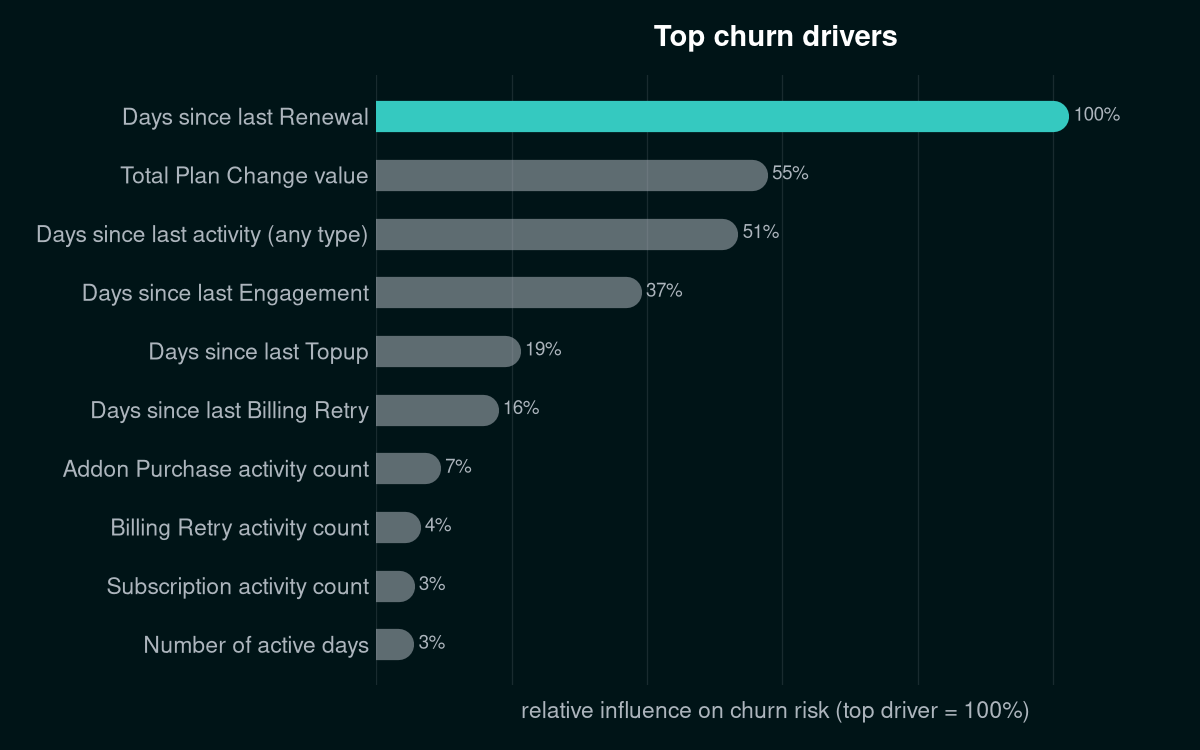
- The top signals actually driving churn, ranked and explained in plain language
- Risk cohorts: which segment of customers is most likely to leave next
- Concrete, prioritised recommendations, not just charts
- Full methodology section for anyone who wants to check the work
Every ranked cause comes with the behaviour behind it, so your commercial team can act on it directly rather than taking a score on faith. Your data team can check the arithmetic behind any one line.
Before You Enter Your Email
The data is synthetic, on purpose
No customer of ours appears in these reports. Each dataset is generated to reproduce the messiness of a real book of business: probabilistic churn, uneven engagement, decoy signals. It is not toy data tuned to make the model look good.
Your email is not a mailing list
We send the report, and one follow-up asking whether you want this run on your own data. That is it. No newsletter, no sharing with anyone, and replying "no thanks" ends it.
Your own data stays yours
If you go further than the sample, work runs on hashed identifiers by default, is processed in the EU, and the data is deleted after analysis. On-premise is available where policy requires it.
Get the sample churn diagnostic
Pick whichever industry is closer to your own, enter your email, and the matching diagnostic PDF is on its way in about a minute. No account, no data upload.
On Your Own Data
The Revenue Diagnostic runs this work on your own base, alongside the acquisition return and cross-sell picture, on one set of numbers. Churn is the part of it we will prove in advance: we seal a prediction of who lapses next, declare the accuracy we expect in writing, and open it against your real churn 30 days later, before you commit to anything ongoing.
